Tampa City Flag
How a reimagined city flag could transform the identity of Tampa and create a symbol worthy of a dynamic, growing city.

Three years ago I moved to Tampa, FL pursuing the opportunities that this growing city offers. It wasn't long until I formally made Tampa my home. I fell in love with the city participating in the tech startup ecosystem, creating an educational non-profit, bonding with locals, going to Lightning games, and supporting Baker Mayfield on the Buccaneers. This lead me down a path to discovering the history of the city and how it came to be one of America's largest growing cities. I have spent many hours at the Tampa History Center[1] immersed in the rich history of Tampa. I believe that everybody that moves to a new city must learn the history of that area. With a new found pride in my new city I stumbled on a TED Talk, Why city flags may be the worst-designed thing you've never noticed by Roman Mars [2]. City flags are representation of civic pride. Cities like Chicago and Amsterdam take ownership of their flag as an insignia of their pride in the city. Chicago policemen and firemen are often buried in a Chicago flag over the American flag. I then searched the Tampa city flag and was disappointed in what I found.

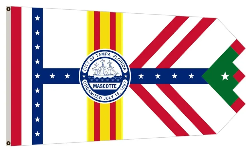
Tampa's current flag desperately calls for a redesign. The flag violates nearly every principle of good flag design laid out by the North American Vexillological Association [3].It's asymmetrical shape with the jagged edge immediately breaks from traditional flag construction, making it difficult to manufacture and recognize from a distance. The flag uses four different colors, exceeding the recommended two to three basic colors that make flags both memorable and meaningful. It's greatest sin is the prominent placement of the city seal in the center. The seal's intricate details, including the ship Mascotte and the surrounding text, become completely illegible when the flag is flying high above the city or reduced to smaller sizes.
Tampa's flag should be recognizable and simple similar to Chicago's flag with it's striking red stars and blue stripes, or Amsterdam's bold crosses and stripes that appear throughout their city. Tampa needs the same level of civic pride and recognition in our flag. Imagine a flag that captures Tampa's essence – perhaps drawing from it's rich history – all rendered in simple, bold elements that a child could draw from memory.
The Tampa flag was approved in 1930 to represent three major acquisitions in Tampa's history.
- Spain's initial exploration in 1528
- England's purchase of Tampa in 1763
- The United states purchase of Florida in 1821
- As well the colors of Italy and France in their contribution of growth
The representation is beyond the city lines of Tampa. The major events that are showcased are the acquisition of Florida not Tampa. We are not representing Florida with our flag. We are representing Tampa. It also important to note that the City of Tampa was not recognized until 1887 after the acquisition by the United States. Why would we have another country's colors when the city didn't exist when they had ownership. Let alone the fact that we represent other country's for a city flag in America.
The seal in the middle is represents Henry B. Plant [4] and his ship the Mascotte. After the discovery of large phosphorous mines, Plant made large investments in a railway and digging a channel. This is largely considered the genesis of the city we know today. Tampa's development has grown from the representation of the current flag. Lackluster design aside, Tampa requires a new flag that captures the culture of present day Tampa.
I am introducing a new Tampa flag that captures the history and brings a new form of pride in the city.

I had the goal of creating an icon in the city of Tampa. Imagine a flag that businesses fly proudly outside of their doors. A flag the Tampa Lightning wear on their shoulders. A flag that the Tampa Buccaneers wear on their helmet. A design system for city development projects. An icon that tourists can buy merchandise to wear back to their homes.
Each component of the flag represents a key participant in Tampa's growth and identity.
Lightning Blue Background - Tampa has the most Lightning strikes per square mile [5] making it the lightning capital of America. We also have 3 time Stanley Cup champions, Tampa Bay Lightning, who are fixed in the heart of the city at Amalie Arena. My flag uses the blue of the Lightning (#003E7E) to represent the lightning capital of the United States.
Pirates Wheel - Pirates are intertwined in the culture of Tampa. With the early Spanish explorers discovering Tampa Bay. When De Soto voyaged to find the Fountain of Youth [6] he found himself making entry at what is now the Tampa port. Our NFL team is named after our pirate culture with the Buccaneers. Tampa also boasts the third largest parade in the country after Mardi Gras and Macy's Thanksgiving parade. The annual pirate-themed parade, Gasparilla [7], attracts over half a million visitors per year.
Three Stars - The stars represent each of three industries that have built Tampa to the city is today.
- Tampa's port lines the eastern coast of downtown Tampa. Represents the industrial impact that Henry B. Plant has on the city.
- Ybor (Cigar City) was the largest cigar producer in the United States. Ybor's cigar production was a catalyst for Tampa's economy and a lot of Tampa's storied characters, Charlie Wall and Salvador Traficante, took place in the Cigar City.
- MacDill air force base being the largest central communications hub places Tampa as a major military force in our backyard. Tampa has been a military city for practically all of it's history with Fort Brooke located at the now campus of University of Tampa.
The marketing division of Tampa has been operating at a significant loss, generating only $1,000 in revenue over the past four years while spending approximately $1 million annually on operations [8]. By creating a strong, recognizable flag design, we open up multiple revenue streams through merchandising and licensing opportunities. Cities with iconic flags like Chicago and Amsterdam have successfully monetized their civic symbols through official merchandise, licensing agreements with local businesses, and branded partnerships. Tampa could follow this model, turning the marketing division from a cost center into a revenue generator through flag-branded apparel, accessories, and licensed products that both locals and tourists would be proud to purchase. This isn't just about civic pride – it's about smart fiscal management that could help offset the division's operational costs while spreading Tampa's visual identity far beyond city limits.
A well-designed Tampa flag could become a powerful symbol of unity and pride, appearing on everything from coffee cups to business logos, just as we see in cities with great flags. The time has come for Tampa to join the ranks of cities that understand the power of a strong visual identity through a properly designed flag.
NOTE - The flag design will be iterated with a professional, Tampa based designer. I think there is an opportunity for the number of spokes to represent something in Tampa. The center stars could have a more specific design to represent each component.
Sources
- Tampa Bay History Center. https://tampabayhistorycenter.org/
- TED. "Why city flags may be the worst-designed thing you've never noticed" by Roman Mars. https://www.youtube.com/watch?v=pnv5iKB2hl4
- North American Vexillological Association. Good Flag, Bad Flag Guide. https://nava.org/content.aspx?page_id=22&club_id=622278&module_id=475717
- Plant Museum. "Henry B. Plant Bio" https://www.plantmuseum.com/about/henry-b-plant-bio
- WeatherBug News. "Top 30 Cities in the U.S. with the Most Lightning" https://www.weatherbug.com/news/Top-30-Cities-in-the-U-S-with-the-Most-Lightning
- Deep South Magazine. "Springs of the Holy Spirit" https://deepsouthmag.com/2015/11/18/springs-of-the-holy-spirit/
- Wikipedia. "Gasparilla Pirate Festival" https://en.wikipedia.org/wiki/Gasparilla_Pirate_Festival
- City of Tampa. "Marketing Division Revenue Report" https://tampa.opengov.com/transparency#/116209/accountType=revenuesVersusExpenses&embed=n&breakdown=types¤tYearAmount=false¤tYearPeriod=false&graph=bar&legendSort=coa&proration=true&saved_view=646261&selection=468C38768182BF1FA744E44AA0329D54&projections=null&projectionType=null&highlighting=null&highlightingVariance=null&year=2025&selectedDataSetIndex=null&fiscal_start=earliest&fiscal_end=latest


